Ya Ha Tinda: A Spatial and Temporal Analysis
AI generated artwork based on the prompt of my analysis.
Background
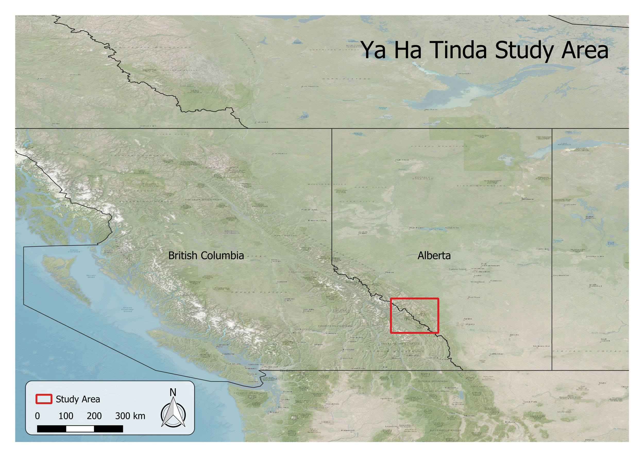
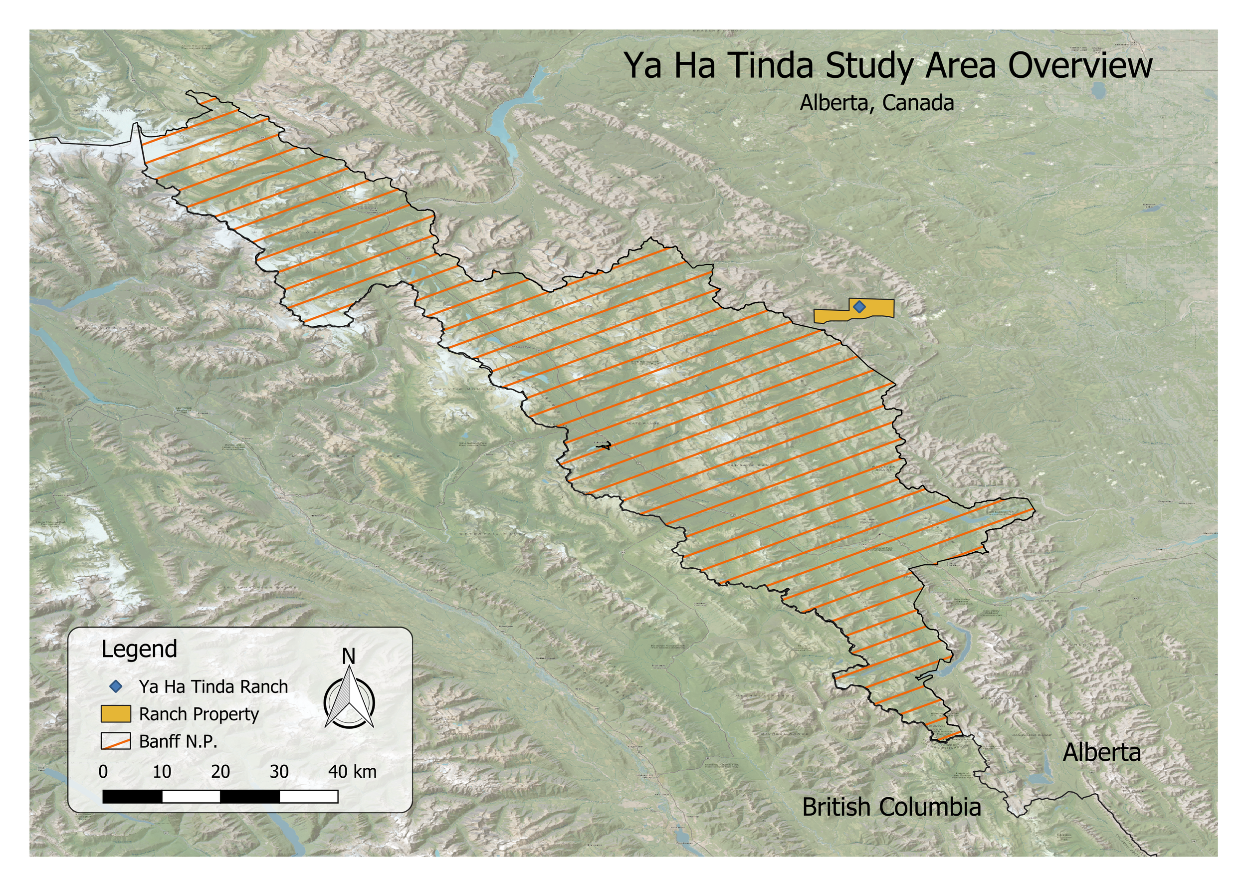
The Ya Ha Tinda Elk herd is located in Alberta, Canada on the northern boundary of Banff National Park (Figures 1 & 2). It is named after the Ya Ha Tinda Ranch which is where the elk have their wintering grounds. The elk herd is estimated to have a population of 350 to 450 elk, a large decline from peak numbers (2,200) in the early 1990s.
The wider relevance of this topic is that the migratory habits of the Ya Ha Tinda Elk herd have been affected and the herd is considered to have lost migratory habits (Insert Citations Here). This is of interest because determining why the herd has lost migratory habits has greater implications beyond elk and includes all migratory species. If reasons for the loss of migratory habits are preventable, or anthropogenic, should we as a species change our habits to promote the ingrained habits of migration in a migratory species?
The Ya Ha Tinda herd in particular is of interest because there is an expansive amount of data published about it (70 journal articles and counting) and elk (Cervus canadensis/elaphus) receives over 130,000 results on Google Scholar. The home range of these elk is near an area where I once lived, meaning that the study of this specific herd has personal meaning as well.
The purpose of this study is to illuminate home range size variability in relation to time (annually) and temperature, as well as migratory habits in relation to terrain.
Figure 1. A small-scale over view map of the study area that provides a sense of location on a continental scale.
Figure 2. A large-scale map showing more details of the study area, such as the location of Ya Ha Tinda Ranch, Ya Ha Tinda Ranch property boundary, and Banff National Park.
Summary
Data Sorting
The data set that was used for the study was massive by most standards and required significant amounts of refining before it was able to be utilized to create the desired products. The data set consisted of 1.59 million data points over a 19-year span, 2001 to 2020, and contained 14 columns of data. Working with the complete, unedited data set proved difficult as it would crash all of the programs it was loaded into, seeing this as problematic, severe editing was required.
Many of the columns were data that were irrelevant to the analysis and were removed for just that reason (tag_local_identifier, visible, gps_dop, individual_taxon_canonical_name, event_id, sensor_type, manually_marked_outlier, study_name, height_above_ellipsoid).
The data that was kept for the study, and primarily focused on involved location, temperature, collar identification, and a timestamp. Using this data I would be able to analyze the location of the elk relative to the time of year and temperature. This initial sort was purely visual and included no parsing for missing or incomplete data.
Finding incomplete or missing data came as no surprise in a data set so large, but it was unexpected that such a significant portion of the data was missing. When the data was sorted to filter out any data listed as “NA” 600,000 data points were removed. The missing data points were “temperature” from the years 2001 to 2012, I’m assuming this is because the collars that were utilized during this period did not have the capability to measure temperature and, that following 2012, new collars with temperature capabilities were used.
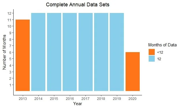
The years remaining were 2013 to 2020, eight years of no missing data, which is still plenty. Although, it is important to distinguish between “missing data” and “incomplete data”. After creating a graph to visualize complete annual datasets, it was found that the years 2013 and 2020 did not have twelve months of recorded data, requiring them to be removed from the study data (Figure 3).
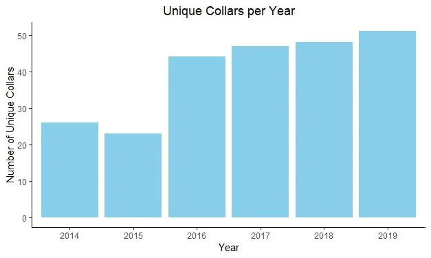
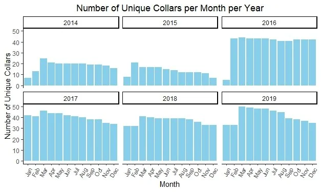
Now that the data was deemed “complete” it was time to understand the composition of the data and look for any anomalies. To do this, an examination of the number of unique collars per year was conducted and found that the number of collars in 2014 and 2015 was nearly half of the number of collars compared to other years (Figure 4). Diving even deeper into the number of collars, further grouping was done to examine the number of collars per month per year. From this graph one can see that January of each year has a lower number of unique collars, but that it steadies for the remainder of the year (figure 5). Finding that 2014 and 2015 had nearly half the number of collars, this information was important to note as the study progressed as it may explain any possible discrepancies.
Figure 3. After filtering the data to remove “NA” values, I used a bar graph to visualize the complete data. As one can see, the years 2013 and 2020 did not have 12 months of collar data.
Figure 4. A graphic representation of the data used to visualize the number of unique collars used per year during the study period.
Figure 5. A graphic representation of the unique collars per year, further analyzed to show variability in unique collars per month per year.
Home Range Variability
A primary interest in this analysis was to look into the home range variability of the Ya Ha Tinda elk herd and its relationship to both time and temperature. Elk are considered a migratory species, therefore a relationship between time and home range and/or temperature and home range should be able to be established.
Temperature vs Home Range
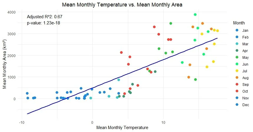
Temperature and home range were analyzed first because temperature is indicative of a changing of seasons, particularly growing seasons, meaning that there would be more widespread available forage during this period of warmer temperatures. The analysis between home range size and temperature did indeed find that there was a strong relationship, with an R^2 value of 0.67 and a p-value of 1.23e-18. From the figure, one is able to see that the months with colder temperatures also have a reduced home range size, whereas the months with warmer temperatures have larger home range sizes (Figure 6).
Figure 6. A point plot comparing mean monthly temperature to mean monthly area for each month of the study (2014-2019). The data depicts a trend that colder months have a smaller monthly home range size. This is further confirmed by the trend line fit, adjusted R^2 value, and p-value.
Time vs Home Range
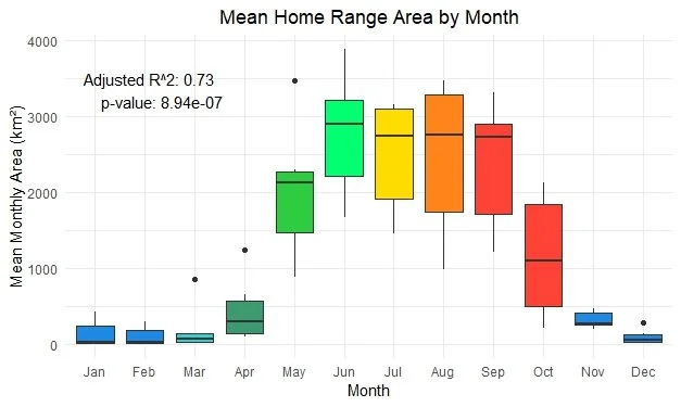
The relationship between time, defined as month of the year, and home range size was analyzed after analyzing the relationship with temperature and home range size. The case for this was that home range size was predicted to be more closely associated to changes in temperature rather than the month, which is a human concept used to measure the time of year. The same statistics were computed and a box plot was used to show the relationship between home range size and time. Interestingly enough, time was a better predictor of home range size than temperature was in terms of the R^2 value, 0.73, but it did not have a higher significance in p-value, 8.94e-7 (Figure 7). Interpreting these values, one can conclude that the time variable explains a higher proportion of the variance in home range size when compared to temperature as far as R^2 values are concerned. When referring to p-values, both values are well below any statistical threshold of significance, but because temperature has the more significant p-value, it does mean that there is indeed a stronger statistical relationship between temperature and home range size than month and home range size.
Figure 7. A box plot depicting the relationship between month and mean monthly home range size. The plot shows that home range size is larger in the summer months as well as more variable. The relationship between “Month” and “Mean Monthly Area” is strong as confirmed by the statistics.
Temperature vs Time
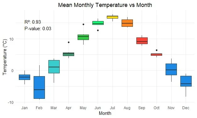
Due to temperature and time being so similar in their relationship when predicting home range size, an analysis was performed to measure their statistical similarity. An R^2 value of 0.93 and a p-value of 0.03 were determined (Figure 8). This means that 93% of the variance in temperature can be explained by the month and that there is only a 3% chance of this relationship occurring by chance. The original intention for using temperature rather than time was that temperature would be a proxy for time and that temperature was physically felt rather than time, but time is a variable in amount of light which is also physically noticeable. In this circumstance there is probably a multicollinearity effect occurring.
Figure 8. A point plot showing the relationship between time (Month) and Temperature. There is a defined cyclical pattern and is statistically significant. It does visually appear that there is more variation in winter temperatures than in summer temperatures, but this has not been statistically tested.
Determining Home Range Methodology
When initially processing home range sizes, the values calculated were well over 1,000km^2 in size. With no values to compare it to, a search was conducted to compare home range sizes with findings in published papers. What was found in the papers was that home range size in the Black Hills of South Dakota can exceed 350km^2 (Benkobi et al. 2005) while in other areas, such as near Bancroft, Ontario, the mean annual home ranges were 110.3 km^2 (Rosatte 2016). The contrasting values did not make sense as to why the values calculated in this analysis were so much larger, so alternative methods of home range size calculations were adopted. The home range size calculations adopted for this analysis are purely experimental and are unique to this project.
Minimum Convex Hull
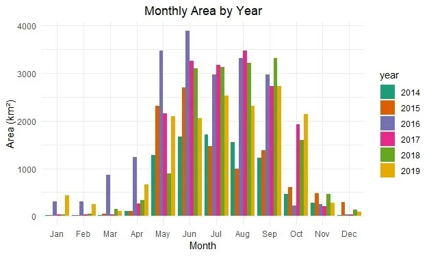
Minimum Convex Hull (MCH) is a standard method for calculating home range and is not one of the experimental home range size calculations (Figure 9). The MCH is defined as “the minimum convex set enclosing them all, yielding a polygon connecting the outermost points in the sample and all whose inner angles are less than 180 degrees.”. Using this method, monthly home range sizes varied from 10s of acres in winter months to nearly 4,000km^2 in June of 2016 (Figure 10). Such seasonal differences in home range sizes bring to light elk's behavioral adaptations to environmental conditions, particularly in relation to foraging needs and climatic factors.
Figure 9. A map that showing how the home range size was calculated by month using the “Minimum Convex Hull” (MCH) method. The year 2019 is depicted as an example, other years are excluded from the map in order to reduce crowding and provide a clearer analysis of a single year. This method created similar maps for all years.
Figure 10. A bar chart representing the monthly home range size for all years of the study using the Minimum Convex Hull method.
Buffered Path
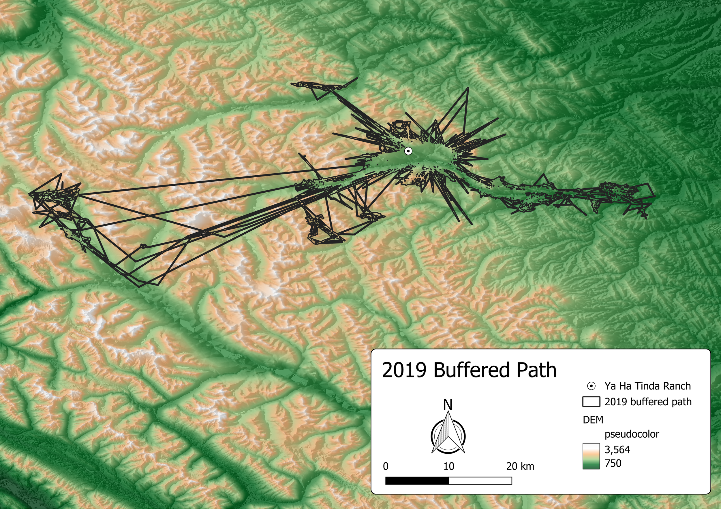
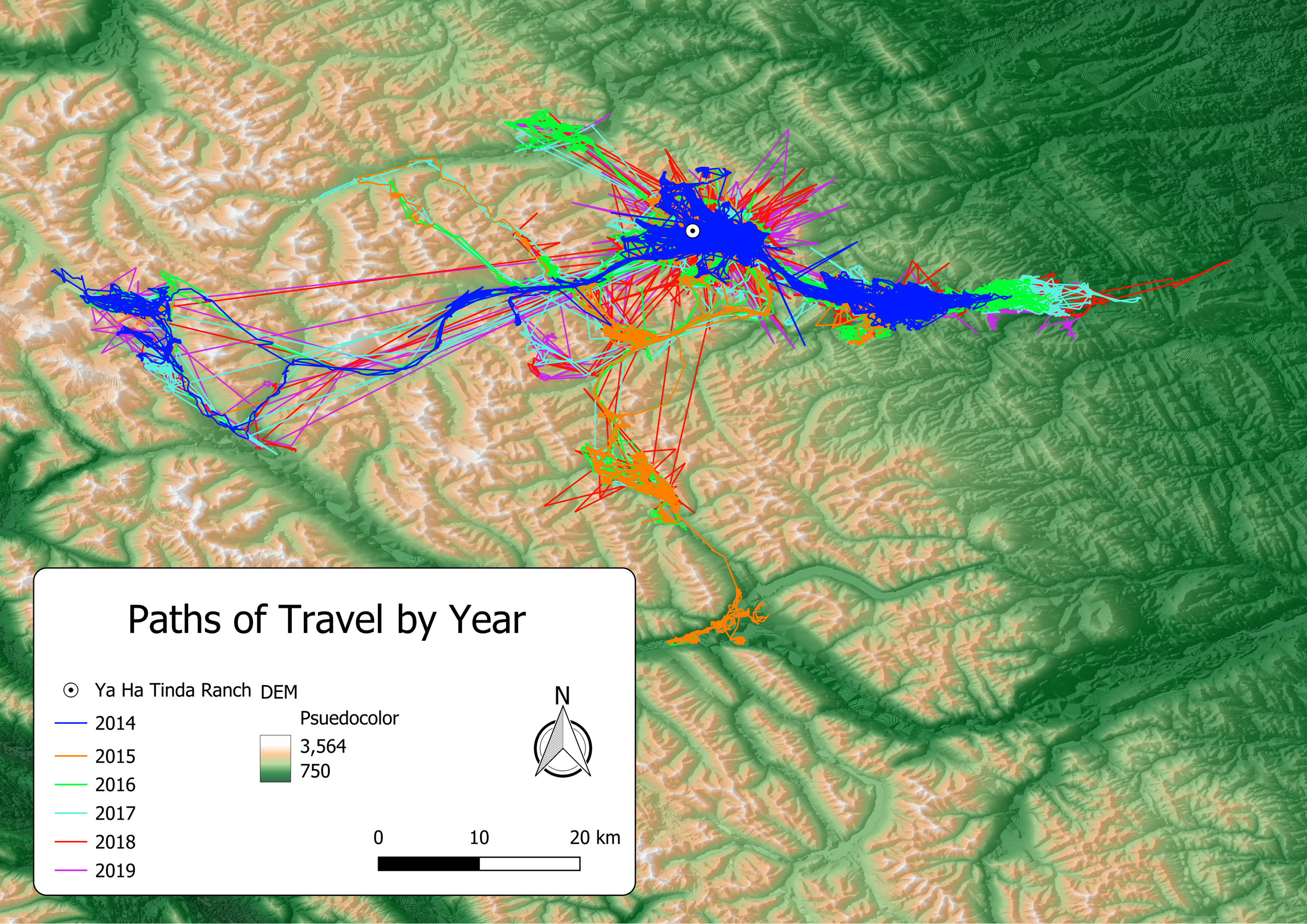
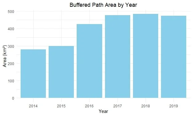
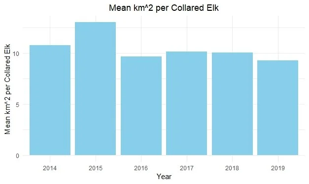
In the Buffered Path method, paths taken by the elk were used as the basis for calculating home range sizes. This method is particularly sensitive to outlier data points and can be influenced by the duration between data collections. For the sake of clarity and due to its susceptibility to outliers, only the year 2019 was depicted in this analysis (Figure 11). The visualization shows a concentration of activity around the Ya Ha Tinda Ranch, as indicated by the “bubble” effect, which results from a high density of paths in this area. This method offers insights into the spatial dynamics of the elk herd, highlighting areas of frequent use and movement patterns within their habitat (Figure 12). I found that this calculating home range size using this method provided the most accurate results when contrasting home range sizes to other papers. The largest home range size was measured in 2018, with 475 km^2 (Figure 13). When reviewing figure 13, one can see that the years 2014 and 2015 had much lower areas relative to the other years of the analysis, this brings us back to the point made under the “Data Sorting” section where it was highlighted that 2014 and 2015 both had nearly half the number of collared elk as the other years. To determine if having nearly half the number of collars was the issue, the average area km^2 per collar was calculated for every year to produce the mean km^2 per collar (Figure 14). Reviewing figure 14, one can see that 2014 and 2015 actually had the largest area per collared elk and that the differences is total home range size may be explained by the number of individual collared elk.
Figure 11. A map showing the buffered path method of calculating home range size for 2019. The buffered path home range method is susceptible to outlier data points and/or poor path representation due to long periods of time between data point collection. For the purposes of displaying the buffered path home range method, only 2019 was shown to improve clarity. There is a “bubble” around the Ya Ha Tinda Ranch due to a high concentration of paths which were removed from the center while performing the buffer function with “dissolve” selected; this is intentional.
Figure 12. A map showing the paths travelled for all years of the study. Each year is unique and not all areas are utilized annually. The paths are the basis for calculating the “buffered path” home range size.
Figure 13. A bar graph showing the home range size by year when using the buffered path method. Years 2014 and 2015 have noticeably smaller home range sizes relative to 2016-2019.
Figure 14. A bar graph that shows the value of the Elk/Area index (Home range area / # of unique collars in study year). These values help show that the years 2014 and 2015 did not actually have noticeably home range sizes, but rather had many less collared elk.
Donut aka. Multi-ring buffer
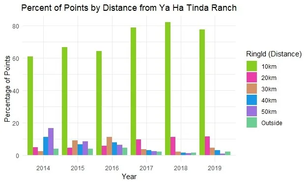
The Multi-Ring Buffer (MRB) method, another experimental approach adopted in the study, involves the creation of concentric rings around a central point, in this case, the Ya Ha Tinda Ranch. Each ring's diameter increases by 10km, with the largest ring extending to 50km in diameter. This method, while not optimal for representing the full extent of the elk's home range, is useful for estimating the density of points relative to the Ya Ha Tinda Ranch. Once again for the purpose of clarity the map seen in Figure 15 represents the data from 2019. In the map one can see that the majority of points are within the 50km buffer mark, and an extremely high density of points are within the 10km ring. This pattern is prevalent in every year of the analysis, having no less than 60% of the points outside of the 10km mark (Figure 16).
Figure 15. A map showing the “Donut” or Multi-Ring Buffer (MRB) home range size method. The diameter of each ring increases by 10km from the center, the largest ring having a diameter of 50km. This method is a poor representation of home range size because it does not capture all of the points in the home range, which are used annually. The MRB is better suited to estimate density of points within the home range relative to a certain feature, in this case it is the Ya Ha Tinda Ranch. This map only depicts the data from 2019 to improve clarity of the methodology.
Figure 16. A bar graph depicting the percent of points in each ring of the Multi-Ring Buffer, or beyond the buffer, split by year. From the bar graph, one can interpret that the elk congregate around the Ya Ha Tinda Ranch, especially within 10km.
Slope
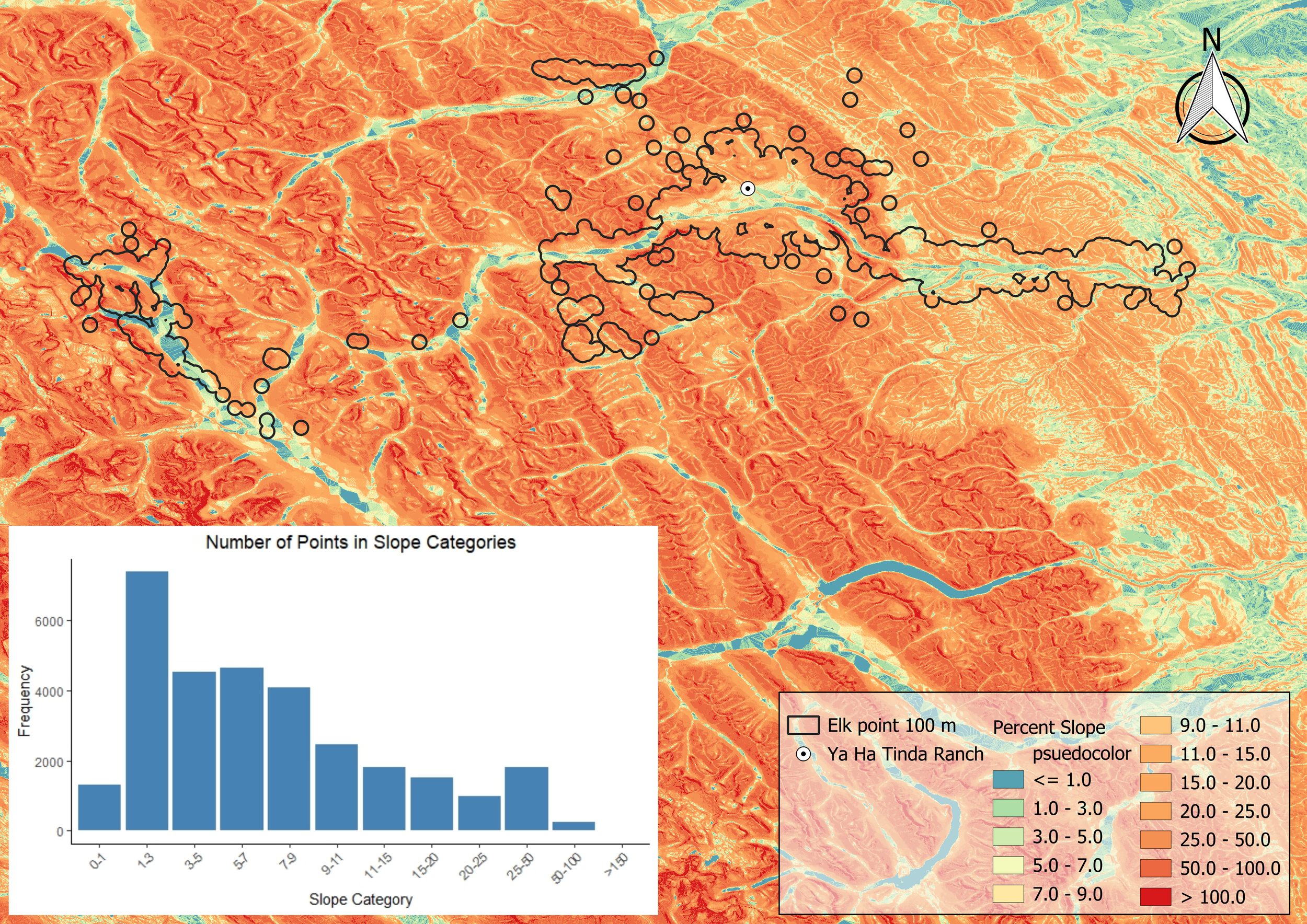
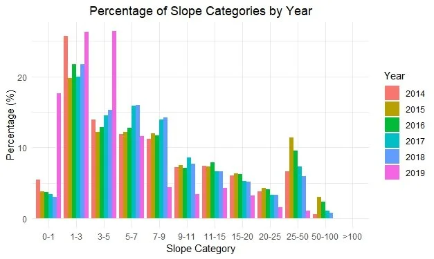
After running the analyses to determine home range sizes, it was apparent, especially from the paths, that elk preferred to stay in valley bottoms or on relatively flat terrain. In order to conclusively state that fact, a slope analysis was completed. Using the DEM file to create a percent slope map, the points then “sampled” the raster for the raster values in which they overlayed. From figure 17, one can see that there are “bubbles” around the valley paths, this is a manufactured effect caused by buffering and dissolving the points in order to better represent the area below the points. Where there are larger bubbles, there is a higher density of points. It is very apparent around the Ya Ha Tinda Ranch and the valley to the east. Figure 17 depicts the year 2019, but it is a clear indication that a majority of the time, elk are on relatively low slope angles (9% or below). A completed bar chart representing every year of the study can be seen in figure 18, it shows that the trend from 2019 is also present in all other years of the study.
Figure 17. A map and graph that displays the frequency of time spent on differing slope percentages. From the graph one can see that elk spend more time on slopes at 9% or below. The map shows that elk congregate and spend much of their time in or near valley bottoms. The “bubbling” effect is due to a high density of points and was buffered and dissolved in order to better display the raster values underneath.
Figure 18. A bar graph that shows the percentage of points taken and at what percent slope the elk were on at the time of sampling. It is clear that a large majority of the time, elk are on slopes less than 10%. The rise in percent of points in the 25-50% slope category is most likely due to that being a more expansive slope category than the previous slope categories (25% points vs 5% or 2%).
Conclusion
To conclude this analysis and investigation of the spatial and temporal habits of the Ya Ha Tinda elk herd is premature at best. The amount of study that can be performed on this topic is immense due to the amount of data available for the topic and the implications of the findings as we transition into a warming anthropogenic driven climate. The Ya Ha Tinda Elk herd is of special interest because of its intersection in land management (National Park and Crown Land), hunting regulations, land use changes, winter forage availability (Ranch supplied feed), and exposure to tourism. Some of the most recent papers show that the elk herd is in fact losing its migratory habits because there is winter forage available and predation risk is reduced when not migrating (Williams et al. 2021, MacAuley et al. 2022). It will be very interesting to learn how this study pans out in the future and what management strategies will be devised using the data from this long-term study.
If I were to continue on this project, I would next analyze the relationship of elk movement and NDVI values to see how closely they are tied together as the availability of forage could be a better indicator of migration timing than temperature or time. I would also like to investigate further into the relationship of elevation and slope for the purposes of knowing smaller details of their migration patterns. Are elk then more likely to spend time on southern aspects due to increased forage, therefore their tolerance to steeper slopes is increased when the aspect is south? Questions like that are interesting and may have implications for future work, perhaps in rehabilitating an area it would be more important to focus recovery efforts on south aspects over north to improve elk populations. The wondering and wandering will go on.


